Thursday, 5 May 2011

Final animation!


Evaluation
This is my final animation it lasts 36 seconds in total. Originally my animation was supposed to be 30 seconds long, but after having to add more frames to make my animation run more smoothly it extended the time. Eventhough it is over the brief requirements i don't think the animation is unnecessarily long. Overall, i wasn't really looking forward to this project, i should have seen it as a challenge or something new but instead i was dreading it. As i have never done anything in animation before i really struggled with the software, ending in many mind changes and last minute decisions! But now that it is all complete, this is the project i have learnt the most from through the whole year. I am fairly pleased with my final animation, and although i understand it is not perfect and there is definitely things that could be altered throughout i am proud of my outcome and think its not too bad for a first attempt. Through this project i have learnt alot of new skills and software and think it is something i wouldn't mind trying again maybe with a bit more time and patience...

If i was to do this project again i would definitely try and alter the flying frames so they run more smoothly, i think it is just missing one wing movement to correct this, i would also leave more time for the dancing scene and maybe slow it all down. Overall i have quite enjoyed this project despite my first doubts.
Dancing

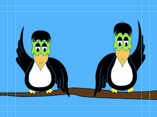
For my final scene i wanted to show a quick section of the 2 birds dancing together, unfortunately this didn't turn out aswell as planned (as shown in my final animation). As i was already over 30 seconds when it came to editing my final few frames i couldn't add as many frames as i would have originally have liked meaning the birds appear to be dancing probably a little too fast. But practice makes perfect and i am happy with what i have achieved so far. 


This is the two frames i used for the dancing birds. I used quite alot of frames for this section to give the impression of movement, just would have liked a bit more time to slow the dancing down a little.
Or more time to edit my previous footage so i could have fit it all in!
Either way its a learning process and i will make sure not to make similar mistakes in the future.

Love

My next stage of my narrative was the birds falling in love and dancing. Although i wanted the birds dancing to be one of the main parts of my animation, the more frames i did i realised this wasn't going to be the case. Although this was my original plan i don't think it is too much of an issue as there is alot going on before hand.


The next main thing i wanted to show in my animation was "love". Since the dancing was no longer going to be a main theme in my animation i decided to make "love" it instead. To do this i used the shapes tool on Photoshop to create a simple heart shape. I then wanted the hearts to lower from the top of the screen to just above the birds head where they would then flash.


Starts off with the hearts just appearing at the top of the screen.
Gradually moving further down...


Till eventually the 3 hearts are placed just above the two birds heads.


The hearts then begin flashing and disappearing, from left to right. I created this by placing a frame of just the 2 birds inbetween every frame.


2 hearts flashing...


Finally leaving me with just one heart which then goes off the screen to leave it open to the next scene.

Birds Meeting

The next part of my storyboard shows the two birds meeting, falling in love and eventually dancing together! 
As you do...
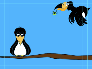
Again along with the flying toucan i now had to show the bird lowering onto the branch alongside the other toucan. Although this was slightly easier than the flying i still found it difficult.

I knew the bird still had to look as though it was flying but had to drop much quicker than the previous 
slides.
As the other slide finished with the bird almost off the screen, i decided to bring in a new slide which shows the bird appearing from the top of the screen, with the branch with the other toucan on along the bottom. I found this was the easiest way to incorporate the two birds without showing too much of a jump between slides.


Flying

This was the bit i was dreading the most as i knew i would find it difficult to give a smooth sign of movement and for the animation not to look jumpy.

I first of all began by thinking about the movement of a birds wings.


  • Up
  • Side
  • Down
  • Side
  • Up

I'd also needed to show movement across the screen as well as the bird moving down the screen. To show movement across the screen i decided to use a cloud, which i could put into different positions on the screen depending on the movement of the birds wings.

After much confusion this is what i came up with...
And I'm still not sure its right!


Up x2


Side x2


Down x2

Again these were scanned in drawings which i then draw again in Illustrator and coloured in Photoshop. I decided to use the cloud as a way of showing movement by moving it from left to right. I hope when this is all put together in my animation it will work smoothly.


Creating my slides

Since i knew my animation had to be around 20-30 seconds it was easy to work out my frame rate, after a little bit of thinking and research, i decided my animation was going to be set at 12FPS. This means i would need a total of 240 images if my animation was to be 20 seconds long, and 360 images if my animation was to be 30 seconds long. 

For the beginning of my animation i wanted the bird to be looking around in hope that someone would come and make his dream become reality. 

x 4


x4

Then repeat...
I didn't want the bird to look like it was turning its head really fast, i wanted it to look more of a curious glance. This is why i had to use more frames, i tried with the idea of using less frames but the speed wasn't correct.

I then went on to look into a way of engaging the audience into my story before they have seen the whole animation. Since i didn't want any type in my animation i found the best way to do this was to show what the bird is thinking.


x2


x2


x2


x2


x2


I then decided to alternate the dance scenes over and over to give the feel of movement. I think this scene worked very well.

Illustrator

After having a few attempts of using my drawn character designs, I decided i wasn't impressed with the outcome. The lighting never seemed right which meant my drawings we all dull and not as bright and vibrant as i had in my head! Looks like stop motion isn't the one for me...


I then went on to scan in all my drawings and see what i could create on Adobe Illustrator.


Here is an example of the toucan with its wings down, to create this character i simply scanned in all my hand drawn images and opened them with Illustrator. I then went on to create a second layer in which i could begin to draw over my hand drawn image. Each character was drawn with the pen tool at a thickness of 1 pt.

I then went on to transfer all my hand drawn images into Photoshop so i could then add colour. I wanted each slide to be bright and vibrant so to create this i used only block colours. I believe this worked well to created my desired effect.


Here is an example of the colours and layout i used for each slide, i have decided to keep the colours similar throughout. This is to avoid confusion and keep the animation simple, as i learnt the more thing you alter the harder it is for your animation to run smoothly! 
I really liked the effect that has been created by using both Illustrator and Photoshop, i think it looks very clean cut and will (hopefully) be the making for a effective animation.

I then went on to colour each slide in detail...

Characters

I decided to go with the idea of using a Toucan i felt this was the character i could get the most personality and potential out of. I began sketching a range of different positions and expressions for my character.


I also looked into the different positions of the birds wings for when it was flying.


I now need to decide whether i am going to simply colour the scanned drawings in on photoshop, or use the pen tool on illustrator for a cleaner finish.

Audio

Now that i had my final idea i needed to decide what time slot i would base my narrative round. I was advised to use a program called Wave Pad, although i have not used this piece of software before i found it simple to understand. You basically just cut out the sections of the song you don't want leaving you with your desired piece of music.


After listening to the song over and over and cropping different sections to see which one would work best i went with 10 seconds plus. I thought this was the best section of the music to use as it includes the build up in the song.

Tuesday, 12 April 2011

STORYBOARD.


This is my narrative for my final animation piece. I decided to go with the idea of using a Toucan dancing as i feel the idea was most suiting to the music, and i feel i could have alot of fun with it. This is just my first draft of my storyboard, i now need to draw each slide in more detail so the story is obvious to the reader without my explanation. The final animation will be made by using plasticine and outdoor environments, where i will then photograph each frame eventually completing the animation in stop motion.

Storyboard Ideas

Now that i have my three words i need to decided on narrative ideas. Since i have already decided my chosen character is going to be a bird most of my ideas keep with this theme. But before i had the idea of using a bird i came up with some other ideas...


Above is my first ever narrative idea, in this storyboard i will take a selection of images of peoples facial expressions, while wearing a Brazil carnival mask. Each expression will be different (even if only slightly) and will fit in theme with the music. The images will then be put together using stop motion.


Monday, 11 April 2011

Birds and Clay

Now that i have decided on my character for my animation, i have began to look into how i will construct the storyboard. Clay? Hand drawn? Still frames?
I am most drawn to the clay idea as i think it will be a good media to create character with. Here are some examples i found on the internet.


I particularly enjoyed this video as it is something a little bit different, not only does it show the use of clay but it shows the making of the character. This video will give me inspiration when creating my own bird.

While looking through Youtube i found it increasingly hard to come across any bird animations made from clay, especially impressive ones.


I also came across this video, which isn't exactly anything special but you get the idea. I am going to give this idea a try for myself, hopefully it shouldn't be too difficult!

Rayograms

I have never really done rayogram's before, or knew what they were for this matter. I found the tutorials with laura really helpful as it give me an insight into something knew. We were then left to create are own rayogram's and see what we could produce. I decided to use jewellery and paper clips as i thought this would create a good outcome, i also think the perfume bottle works well as you can see the insides of the bottle.


This is my outcome:


I used a test strip so i was able to see which one created the best exposure. Using 1,2,3,4 and 5 seconds, i decided the best outcome was at 4 seconds.

These are a few of my favourite rayograms...


The necklace didn't work as well as i would have liked it on the pendant but i still think it has created a nice effect.


For this piece i used a range of square pieces of paper with smaller squares cut out the middle. I arranged them in an uncontrolled fashion, i think this is one of my favourite rayogram's.


This piece didn't work quite as well as i wanted it too, but still think it has created a nice effect. I placed me hand at different angles and heights for 1 second at a time to create this desired effect.


Sunday, 10 April 2011

Kate Nash


Now that i have chose my character i am trying to gather as much research and thoughts as possible. This is when i remembered this song, i remember listening to this song ages ago and coming across the animation version on Youtube. Someone has created an animation for pretty much all her songs, but i thought this was most fitting.

Character Development

Now that i have decided that my chosen character is going to be a bird, i now need to choose, what kind of bird? I've started drawing up some (very rough) possible character ideas.


Eventhough i am beginning to steer towards the toucan idea, i think i need to maybe come up with some more character designs. 

Saturday, 9 April 2011

Workshop Session

We were given a session on creating an animation. We were told to draw a selection of several basic characters, the characters could be literally anything you wanted but trying too keep it simple. We then had to choose one of the finished characters and draw it from a range of different angles, then working in pairs or groups we had to come up with an animation using each persons character. The animation needed to show a beginning, middle and an end and be made up of 36 hand drawn images, very tedious! My chosen character was a bird and my partners character was a cat, so we came up with an animation of the bird sat in a tree, when the cat sneaks up on the bird and eventually ending in the bird dying.


These are the first character designs i came up with.


I decided to go with the idea of the bird as i thought this went will with my partners chosen character of a cat. We then went on to create the storyboard for the beginnings of are animation.


Thursday, 7 April 2011

Research into Rayograms

Before my induction with Laura i didn't really know anything about rayograms or what they were for that matter, so i decided to see what other artists had produced to give me a feel for the task.

Define Rayogram- 'A photogram is a photographic image made without a camera by placing objects directly onto the surface of a photo-sensitive material such as photographic paper and then exposing it to light. '


I particularly liked these two designs, i love the idea of using the film as you can see all the twists and turns. I am going to think of using something similar on my own rayograms.


Wednesday, 6 April 2011

Research

While looking through Youtube i came across the two videos shown below. The first one is a short 10 second animation made from paper, the finished animation looks very effective but i imagine it wasn't easy to do! It is something i am willing to try if it is fitting with my initial ideas. The second video is a chalkboard animation, for this particular animation it works very well, but i think if your drawing was to detailed, the excess chalk would end up making your animation looking very messy and unclear.