Monday, 28 February 2011

Su Blackwell

I was lacking in inspiration and motivation for my final piece, but after looking at Su Blackwells work its hard not to be inspired! 

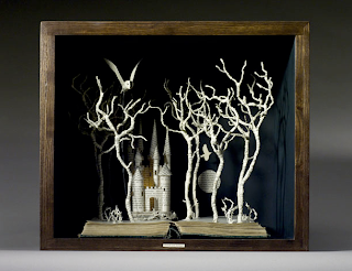
Su Blackwell- An artist and art director working with paper alone,  some of her most inspiring pieces are the book sculptures, in which she carefully sculpts 3D diorama's to then be displayed in a wooden box. Her work has a very vulnerable fairy tale aspect to it, the use of subtle colours supports this.


I love the lighting used in the bottom book sculpture, it gives the book a warm vintage feel, using a yellow lighting is something i would like to look into for my final piece.

Sunday, 27 February 2011

Paper flowers...

I quite like the idea of using flowers as my repetitive pattern, i decided to have a go at making some of my own paper forms and this is my outcome.

I didn't really know where to start for this idea, so it was a case of trial and error. After a bit of playing around with different techniques,folds and cuts i found the most successful route. I started off by using one A5 sheet of white card and drawing a swirl ready to be cut out, then with alot of time and patience carefully constructed the rose. This is my final outcome...


This is the beginning of the rose, i then carefully twisted and sculpted the swirl to create the final outcome. Every now and then stitching pieces together in order for it to stay in this form.


I also had a try at making a different paper form...


This was my second attempt at a flower, for this idea i had to use 4 A5 sheets of white paper, by folding the paper into a simple concertina to create the final outcome.  I definitely think these forms look better 3D than they do photographed. If i was to develop this idea i would try using different lighting to see what different effects i could create to get the most out of this idea, and maybe try using different coloured paper.

Workshop 2

For the second workshop with Richard Sweeney the concept was pretty much the same just with a few less limitations. We were now allowed to use bigger sheets of paper, glue, sellotape, staples etc to keep the form together.  Although i found it easier to hold a structure with the paper i found it harder to think up new techniques and ideas. I decided to  develop my previous ideas and see what i could produce. After alot of messing around this is my outcome. 

I first of all started off with an A5 piece of paper cutting similar size strips...


I then went on to try rolling the paper to see what kind of effects i could create, this particular form reminds me that of a shell. I quite like this idea but think it is lacking in some structure.


I think the form looks like it has more depth from this particular angle...


Keeping with the original piece of paper i decided to see if i could develop the same idea further by adding more twists and folds. I found this worked out pretty well and the sculpture began to show more depth.


Natural forms.

Beauty is in the eye of the beholder...

Nature is all around us, we see it everyday, smell it everyday, but never really take any notice. Its only when you stop and pay attention to the detail you notice the repetition within these natural forms. Looking at images on the internet has definitely inspired me to create more beautiful and inspiring forms. 


Shells-While looking through images of shells i found the simple curved patterns really appealed to me. I think they have quite a simplistic look to them and often if the image is close up it appears almost as a repeating pattern, rather than a natural form. This is something i will definitely look into more when creating my forms.


Flowers-When i think of nature i think of flowers, trees and countryside. The repetitive pattern used in this single rose bud is definitely something that inspires me when creating my forms.  Simplified the pattern in this natural form reminds me of a range of circles getting smaller and smaller fitting together perfectly. I like the idea behind this pattern and its one i would like to experiment with further.


Trees- When i look at images of trees it immediately reminds me of symmetry, although all the branches vary in length, width and size they all appear to be the same at first glance.


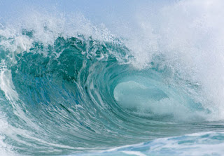
Waves- I really like this image of waves, i particularly like contrast of light to dark within the wave. This could be a good inspiration when photographing my forms in order to get the most out of the sculpture.
Primary research

While walking through town i noticed there is alot of repetition in Sheffield City Centre, i have collected a few images for primary research.

Chairs

Water feature

Buildings

I also love the repetition within flowers...


Monday, 21 February 2011

Julene Harrison


Julene Harrison is a British designer and illustrator specialising in paper-cut artwork. I came across her work by chance while browsing through the internet. Her work follows a similar theme to Rob Ryan's and portrays the same envious talent. Varying from birthday cards, wedding invites or family portraits.


I especially like the idea of the family portraits, i think they capture a different effect and feel to an image, unlike a photograph. Although the paper cut out is also 2D, the image appears more realistic and heart felt in comparison. 


After looking through her website, i found out she also created the famous 02 adverts which spread around the UK over the christmas period. I really like the idea of using hand rendered images alongside computer generated artwork. This is something i have thought about for my final paper sculpture. 


Rob Ryan


While browsing through the internet for inspiration, i came across an artist named Rob Ryan. His work is 2D and mainly consists of paper cutouts and screen prints. I love the detail and delicacy of his work, and especially love the way he incorporates hand drawn type into his pieces. 


Here are some examples of his work...


These are examples of paper cuts he did in 2009. 
Patience is a virtue...


I also came across some screen prints he did in 2006. Equally as beautiful as the paper cuts, but lack  the delicacy and detail the paper cuts involve.

Friday, 18 February 2011

Thursday, 17 February 2011

Workshop 1 with Richard Sweeney

REPEAT.REPEAT.REPEAT.


This was the first of my workshops with Richard Sweeney, we were given one A5 piece of paper; folding, cutting and bending to create a range of different paper sculptures. The limitations given were no glue, tape and one piece of paper per sculpture. After looking through Richard's work i felt inspired to try the task for myself.


After several attempts and pieces of A5 paper, i created the following outcomes.  I played around with lots of different sized strips of paper folding and weaving them into a position in which i thought created the best possible outcome. I found the better outcomes were the ones with the least thought and more spontaneity.


I then decided to use a similar idea for my next paper sculpture, this time using thinner strips of paper but keeping them the same size. At first i decided to keep the sculpture flat on the desk, but after further experimenting i found the sculpture worked best s a 3D cylinder shape.


Richard Sweeney

I wanted to know more about Richard's work as i thought it would help me feel more inspired to begin creating my own 3D paper sculptures. After looking through several blog posts and examples of his work, i was not disappointed. I love the effortless finish to Richard Sweeneys work,  his work is both inspiring and visually beautiful. Something i can only inspire to create.


During the workshop Richard spoke about how nature really inspired the ideas behind his work.  The twists, folds and asymmetric look to this sculpture reminds me of that throughout nature. This particular piece reminds me of a wave or the delicate folds and pleats of a flower.


One of my favourite pieces by richard is this of a cardboard figurine. As effortlessly beautiful the folds, pleats and curve of his paper sculptures are, there is something about this edgy figurine i love.