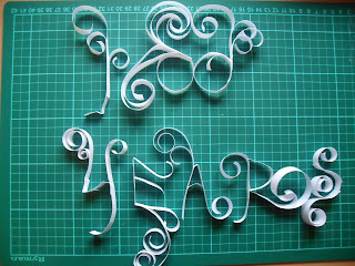
For my final idea i decided to do a Yulia Brodskaya inspired piece. I think the '100 years; is the most important part of the poster so i really wanted to get this across in my final design. I decided to have the '100 years' as the main feature as my poster.
Here it goes...
I first started off by thinking of different ways in which i could create the letterforms but keeping them legible, i sketched out a range of different options before i started creating.
For some reason i had the most problems with trying to decide which way to set up the '100' of my '100 years', I decided to have a go placing the form in different ways, and taking photographs before i got to the workshop.
This way i knew exactly which way to set it up without wasting anytime.
This was the idea i decided to go with, i like the way the design flows and think it will be easy to work with for my final poster design.
The '00' looks too squashed and over crowded...
Once i got into creating the letterforms i started to quite enjoy it, i found the best letters were the ones i didn't really think about, just adding curls of paper where i found necessary. I decided to create the '100 years' with white paper, this was so i could potentially play around with different colours once they were photographed, rather than choosing a colour and being stuck with it.
Final '100 years'.
After the form was created i took a range of different photos so i could begin on the rest of my poster. I firstly started off by taking the form on a white sheet (silly idea), after a few photos i realised i just wasn't getting the depth and shadows in the letters like i wanted.
I also realised that the poster needed to be portrait, so this photograph wouldn't be acceptable.
I then went on to take photos of the forms on a black sheet, i found this to be much more effective and the shadows and depth of the forms really started to show.
Now all i need to do is create a poster...


No comments:
Post a Comment